The Psychology of Color in Health and Wellness Marketing

In January 2025, a team led by Domicele Jonauskaite published the strongest case anyone has ever assembled for color psychology in marketing's underlying premise. Their systematic review pooled 132 studies spanning 128 years and more than 40,000 participants across 64 countries and concluded that, yes, "people systematically and reliably associate colours with emotions." If you sell branding services, that is the sentence you screenshot.
Read the next paragraph of the review, though, and the sales pitch starts to wobble. The authors studied "context-free" associations only, and they are explicit that the leap from a reliable association between yellow and joy to a person actually feeling happy — let alone buying something — is unproven. That gap, between association and behavior, is where most of the color-psychology industry lives. This article is about what the research actually supports, what it doesn't, and why nearly every wellness brand has converged on the same palette anyway.
Does color psychology actually work in marketing?
Partly, and the honest version is less exciting than the agency version. People do associate colors with emotions in a measurable, cross-cultural way. What's missing is reliable evidence that picking the "right" color reliably changes what people do with their wallets. As the marketing writer Zulie Rane put it, after walking through the weak studies, "most branding color psychology is bullshit, despite the popularity of the subject. It's an oversimplification."
A clean example of how conditional these "effects" are: the much-cited finding that red increases attraction was only observed in heterosexual men — the same body of work found no effect on women. A headline color "effect" turns out to apply to half the population under specific conditions. That is the pattern across this literature. The effects are real, narrow, and dependent on context — not the universal levers the pitch implies.
The most useful 2025 finding cuts even more directly against "pick the magic color." A peer-reviewed study in the Journal of Marketing & Social Research, using eye-tracking and experiments, found color can drive brand recognition by up to 80% — but that appropriateness and congruence mattered more than the specific hue. Purchase intent dropped sharply for color-inconsistent products (t(118)=4.87, p<.001). Translation: a "wrong-but-fitting" color beats a "right-but-incongruent" one. The lesson is not which color to pick. It's whether your color fits the thing you're selling.
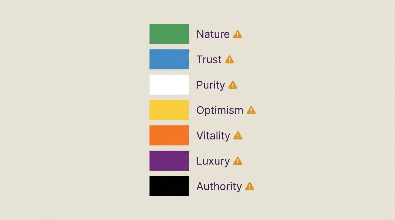
A color-by-color reference — and the catch on each
Here is the per-color reference the searches actually want, with a column the marketing blogs leave off: what the wellness industry does with each color, and the caveat that the sales pitch skips.
| Color | Common marketing claim | How wellness brands use it | The catch |
|---|---|---|---|
| Green | Nature, health, growth, balance | The default for supplements, plant-based food, spa and yoga brands | So overused in wellness it no longer signals anything specific (see below) |
| Blue | Trust, calm, competence | Telehealth, meditation apps, "clinical" wellness | The trust association is the most replicated — and the most generic; it's also every bank and tech company |
| White | Purity, cleanliness, simplicity | "Clean" beauty, minimalist supplement packaging | Means mourning to 64% of Asian respondents vs. purity to 78% of Western ones — the meaning isn't universal |
| Yellow | Optimism, energy, attention | Highlights, CTAs, "positivity" framing | High-attention, but the "happiness" leap is exactly the association-vs-feeling gap the 2025 review flags |
| Orange | Vitality, affordability, friendliness | Activewear, energy and fitness products | Strongly contextual; reads as "cheap" or "premium" depending entirely on what surrounds it |
| Purple | Luxury, spirituality, mindfulness | Premium wellness, "sacred" or ritual framing | The luxury association is largely a historical-cost artifact, not a hardwired response |
| Black | Sophistication, premium, authority | High-end wellness, "science-backed" positioning | Powerful by contrast, not by hue — its effect depends on what it's set against |
The white row is the one that should make any "color = meaning" pitch nervous. In the same 2025 study, 64% of Asian respondents associated white with mourning while 78% of Western respondents associated it with purity (χ²(2, N=285)=42.63, p<.001). A "clean and pure" white wellness package can read as a funeral in another market. One color, opposite meanings — which is fatal to the idea that any hue carries a fixed emotional payload.
Do the famous statistics hold up?
If you have read anything about color in marketing, you have met three numbers: that color drives "up to 90%" of snap judgments, that those judgments happen in "90 seconds," and that "85% of buyers" cite color as the primary reason they buy. They get repeated as settled fact. They are not.
The 90-second / 90% figure traces back to Singh, S. (2006), "Impact of color on marketing," Management Decision 44(6):783-789 — a literature review, not a controlled buying experiment, and one that itself flagged "inconsistencies and controversies surrounding color psychology." The 85% figure traces to a secondary attribution to Hemphill 1996. And a 1990 critical review in the peer-reviewed literature called the field's evidence "sparse and contradictory" — a verdict the headline stats have spent thirty years papering over.
Follow the same trail on the newer 2026 numbers and you find a different problem: most are vendor-reported. A widely circulated claim that storefronts with defined color palettes convert about 31% higher comes from a Shopify commerce-trends analysis, not a peer-reviewed study. It may be true. But a platform that sells storefront design tools reporting that good design sells more is not independent evidence — it's a company describing its own product. The number belongs in the conversation only with that label attached.
Why every wellness brand looks the same
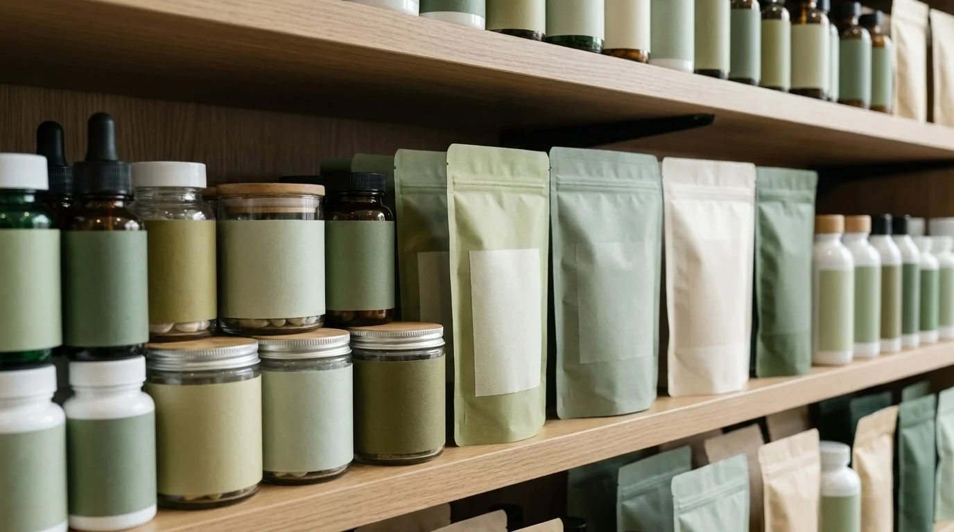
Now the part the marketing blogs won't write, because the people writing them sell color advice. Walk down a wellness aisle, or scroll a wellness app store, and you will see the same palette over and over: green, sage, soft white, the occasional muted terracotta. Green signals nature and health, the logic goes, so a health brand should be green. The logic is sound right up until everyone follows it.
The one genuinely useful, named mechanism in this whole field is the Isolation Effect — "a unique color in a field of uniform hues will stand out more", per USC's applied-psychology program. Read that against the wellness aisle and the irony is total: an industry that worships color psychology has used it to make every brand invisible. When the whole category is sage green, the brand that follows the color-psychology rulebook disappears into it. The color that was supposed to differentiate has become camouflage. Color psychology in branding, applied by everyone at once, cancels itself out.
So who benefits from the rulebook staying unquestioned? Consider a representative example: a wellness-branding agency's blog post lays out the standard color meanings, lists real brands like Calm, Whole Foods, Burt's Bees, Alo Yoga, and Tom's of Maine as proof, and presents the whole thing as settled science — while never mentioning that the same firm sells a "Branding Diagnostic" and "Signature Branding Programs." The post isn't reference material. It's a lead magnet. The certainty it sells is the product, and the science is the packaging.
What to actually do with this
None of this means color doesn't matter. It means color is a question of fit, contrast, and consistency — not a vending machine where you insert "green" and receive "trust." The defensible moves are unglamorous: pick a palette that fits what you genuinely are, keep it congruent across everything, and look at what your competitors are doing so you can avoid disappearing into them. If your entire category is sage green, the on-evidence move is to not be sage green.
And the next time a branding consultant tells you that 85% of buyers choose by color, or that the right hue will unlock a 31% lift, ask the question a reporter would: who ran that study, did they sell anything, and does the source survive a click. The research on color is more honest than the industry that sells it. The gap between the two is exactly the size of an invoice.
Frequently Asked Questions
Partly. Research shows people reliably associate colors with emotions, but the leap to 'this color makes people buy' isn't well supported — context, appropriateness, and culture matter more than the specific hue.
A palette ratio — roughly 70% dominant color, 20% secondary, 10% accent — used to build visual balance in branding. It's a design convention, not a proven conversion lever.
Green signals nature and health, so wellness brands default to it — but when everyone uses the same palette, the color stops differentiating and becomes industry camouflage.
It's widely repeated but weakly sourced — traced to secondary 1990s and 2006 references, not a controlled buying experiment. Treat it as marketing folklore, not hard evidence.