
Redefining Wellness Design: The Art of Color Harmonization


Most advice about calming colors for bedroom skips the part that actually matters, which is why a color would calm you at all. The honest answer is narrower than the inspirational version: a wall color does not fix a hard week, and no shade will out-argue a racing mind at 3 a.m. What color can do is smaller and real — it can lower the amount of low-level work your nervous system is doing while you are in a room, and in a bedroom, where the whole point is to let your guard down, that margin is worth getting right. This is a room-by-room guide to the hues that do it, why they do it, and what to actually paint.
Why color reaches the nervous system
Color does not work by magic or "vibration." It works through the same threat-and-safety machinery that governs the rest of your physiology. Cooler, softer wavelengths read to the brain as low-arousal — nothing to scan, nothing to track — and that interpretation has measurable downstream effects. Reporting on the research, one summary notes that when people are exposed to green, "the parasympathetic nervous system activates, lowering stress hormones and blood pressure" — the parasympathetic branch being the one that handles rest and recovery. The same source describes a controlled experiment in which 83% of participants felt more relaxed under blue light than under conventional white.
I want to be careful here, because this is the point where color advice usually overreaches. These are real but modest effects, measured in controlled settings, and individual responses vary. A color sets a baseline. It does not do the heavy lifting. Keep that proportion in mind and the rest of this guide will be more useful to you, not less.
Calming colors for the bedroom
If you remember one rule, make it this: for a bedroom, choose soft, muted, low-contrast versions of cool and earthy tones, and skip anything bright or saturated. In practice that means a short, reliable palette.
- Sage and muted greens — green is the most consistently restful color across the evidence, and a grayed-down sage reads as calm rather than vivid. Behr named a smoky jade, Hidden Gem, among its 2026 colors of the year for exactly this "moody but uplifting" quality.
- Dusky, gray-undertoned blue — blue is the other strong performer. The undertone matters: a gray-softened blue settles a room, where a clear primary blue can feel cold.
- Warm whites and soft greiges — Pantone's 2026 pick, Cloud Dancer, is a soft airy white framed as "a symbol of calming influence"; Sherwin-Williams' Universal Khaki is the warm-neutral version. Both give you quiet without cold.
- A whisper of blush or terracotta — if cool tones feel clinical to you, a barely-there warm pink or terracotta adds what designers call "visual warmth" without waking the room up.
For named swatches you can actually buy, Benjamin Moore's calming-bedroom set (Palest Pistachio 2122-60, Simply White OC-117, and similar) sits squarely in this range. The thing to avoid is high-contrast and high-saturation — a red accent wall, a bright cobalt — in the one room whose job is to signal that the day is over.
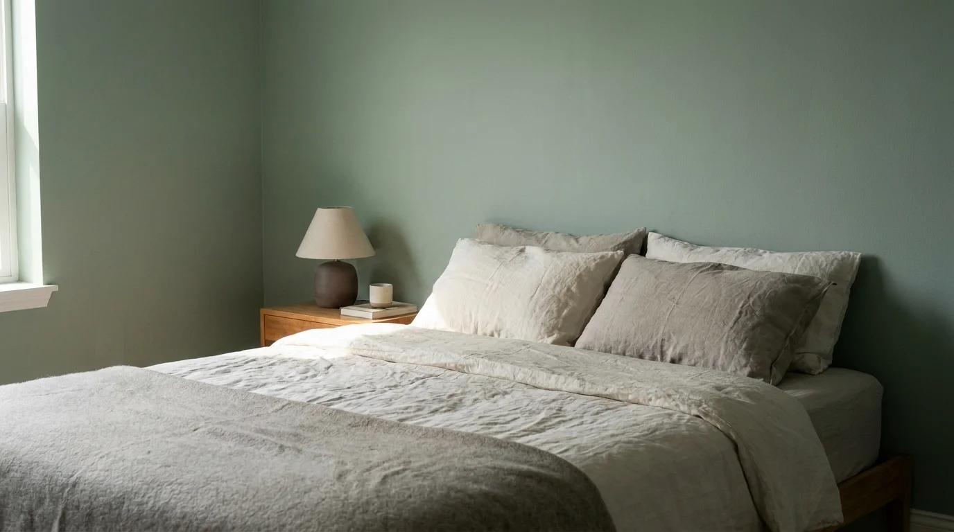
Best bedroom colors for sleep
Sleep adds a second consideration on top of mood, and it is worth its own section because the mechanism is specific. The cells in your retina that tell your brain whether it is day or night — melanopsin-expressing ganglion cells — are most sensitive to blue wavelengths. As one design-science write-up summarizes the Harvard and PubMed research it cites, blue-rich light suppresses melatonin and warm, low-blue light preserves it. That is mostly about lighting (next section), but it also nudges the paint logic: a soft, muted palette supports the wind-down rather than fighting it.
The survey data here is suggestive, not conclusive, and I would rather tell you which is which. A 2024–2025 survey of more than 2,600 Americans found 38% reported improved sleep quality after repainting their bedroom a more calming hue. And the figure people love to quote — that those with blue bedrooms average 7 hours 52 minutes of sleep, the most of any color group — comes from a widely cited 2013 Travelodge survey, which is a hotel chain's poll, not a clinical trial. Treat it as a fun data point, not proof. The defensible version is simpler: soft blues and sage are reasonable bets for a sleep-friendly room, and the bigger lever is the light, not the wall.
Lighting color matters as much as paint
This is the part most paint-led guides skip entirely, and it is arguably more important than the color you choose. Because melatonin is so sensitive to blue wavelengths, the temperature of your bulbs at night directly affects how easily you fall asleep. The practical spec, per LED-lighting guides and sleep resources like Calm: use warm white bulbs in the 2200K–2700K range in the bedroom, and make them dimmable. Cool, blue-toned light signals alertness and suppresses melatonin; warm amber or red light has the least impact of all — closest, as one guide puts it, to firelight or sunset. You can paint the most perfect sage room in the world and undo it with a cold, blue-white "daylight" bulb at 10 p.m.
Color drenching: 2026's quiet trend
The defining interior trend of 2026 happens to have a calming rationale, which is rare. Color drenching means painting the walls, ceiling, trim, and sometimes the doors all in the same muted shade. It looked, at first glance, like a maximalist move; the logic is the opposite. As one 2026 trends write-up explains it: "When walls and ceiling are different colours, your eyes track the boundaries between them. That is low-level visual stimulation your brain processes even in dim light. Colour drenching eliminates those transitions." The room becomes a single visual field with no edges to scan — which is, neatly, the same low-arousal effect a calm color is reaching for, applied to the whole envelope. It is not a fringe idea: in Apartment Therapy's 2026 State of Home Design survey, 140 designers named it the year's most significant paint trend.
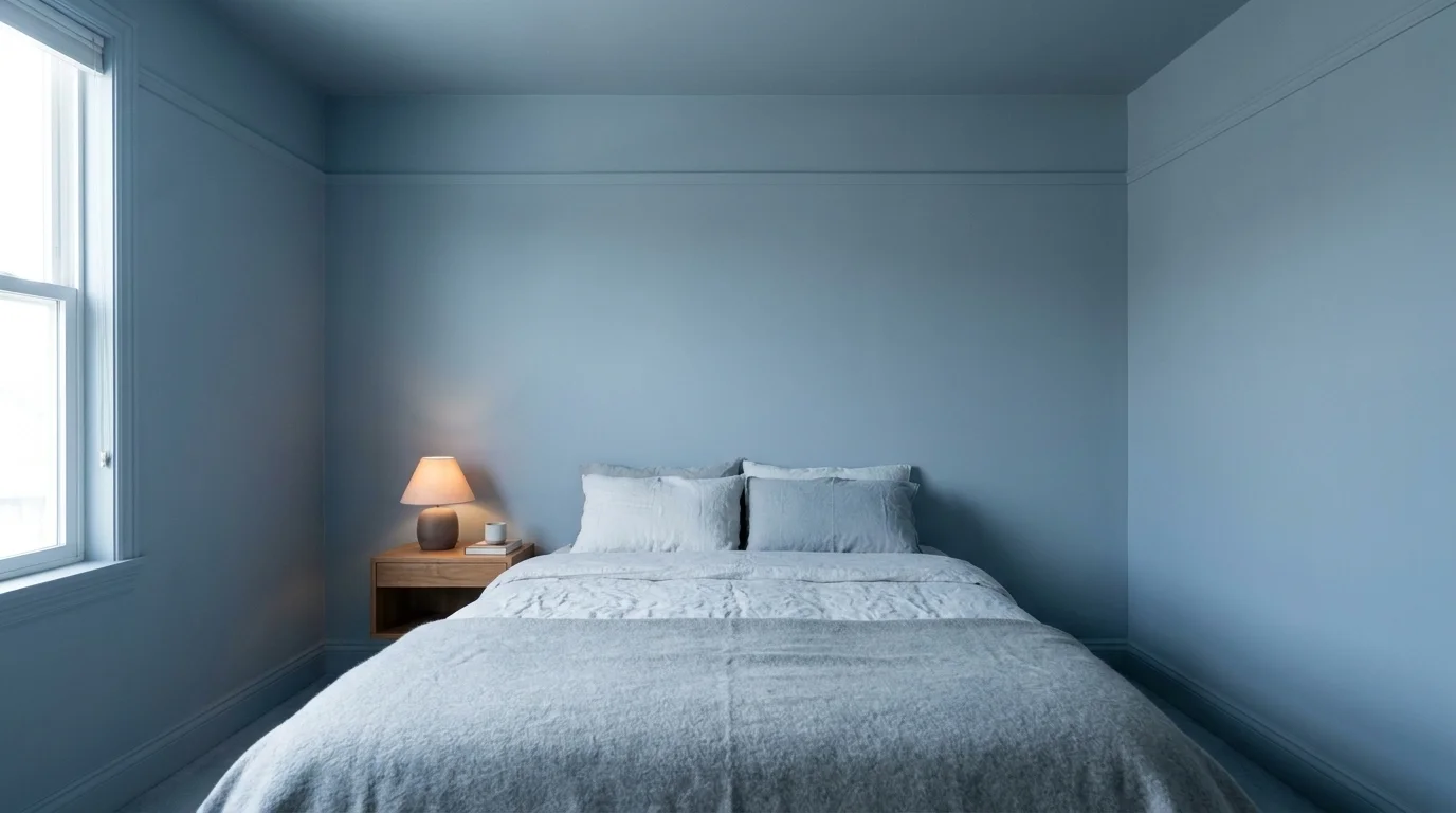
Calming colors for anxiety
This section comes with a clinical caveat, because it is the one most likely to be misread. Color can support a calmer room. It is not a treatment for an anxiety disorder, and I would not want anyone reading this to repaint their bedroom and feel they have failed when the anxiety is still there. Those are two different problems.
With that line drawn: the colors with the best evidence for a calming effect are, again, green and blue. According to Moffitt Cancer Center's stress-and-color explainer, green is a soothing color that can help diffuse anxiety, and blue is especially useful for stress management because it encourages a strong sense of calm. The mechanism underneath, as above, is parasympathetic activation — the body's rest-and-recover response. Keep these soft rather than bright; a saturated blue does not calm a nervous system, it just looks like a swimming pool.
If what you are managing is more than a rough patch — if the worry is constant, sleep is consistently wrecked, or you are dreading the room itself — that is a signal to talk to someone, not to repaint. Therapy is not a luxury, and if you are in crisis, contact the 988 Suicide and Crisis Lifeline. A wall color is a small, kind thing you can do for yourself. It is not a substitute for support when you need it.
Living room, bathroom, and home office
The bedroom is the anchor, but the same logic scales to the rest of the house, with small adjustments per room.
- Living room — this is a room for being awake and social, so you have more latitude. Soft sages, warm greiges, and muted blue-greens keep it calm without making it sleepy. If you want one slightly more saturated element, a living room is where it belongs.
- Bathroom (your spa at home) — this is where the original "spa" idea actually lives for most people. Cool, watery tones — soft aqua, pale blue-green, misty gray — plus warm lighting turn an ordinary bathroom into something restorative. The "spa-at-home" effect is mostly low contrast and warm light, not expensive fixtures.
- Home office — the goal here is a different one: calm but alert, not sleepy. A muted sage or a soft, grounded green tends to do this well, supporting focus without the edginess of a stark white or the drowsiness of a deep tone.
Paint, finish, and how to actually choose
Two practical notes that decide whether any of this works in the real room. First, finish: matte and eggshell sheens absorb light and reduce glare, which reads as calmer; high-gloss bounces light around and works against you in a restful space. Second, test before you commit: undertones shift dramatically with your light. The same "calming paint color" that looks like a soft sage in the store can go gray-green or even faintly yellow on your north-facing wall. Paint a large sample square, live with it for a day across morning, afternoon, and evening light, and judge it then — not under the store's fluorescents.
Where this lands
The realistic promise of calming color is modest and worth doing anyway. Soft, low-contrast greens and blues, warm light in the 2200–2700K range, and a willingness to test before you commit will give you a room that asks less of your nervous system — which, after a long day, is most of what a bedroom is for. Just hold the proportion honestly: the color sets the floor. The rest of rest is built on what you do in the room and how you are doing in your life, and if that second part is the real problem, the paint can wait while you take care of it.
Frequently Asked Questions
Soft, gray-undertoned blues and muted sage greens are the most reliably calming. Both read as low-arousal to the nervous system, and green has the most consistent evidence for a restful, parasympathetic effect. Keep them soft, not bright.
Green and blue have the strongest support: green can help diffuse anxiety and blue encourages a sense of calm, per Moffitt Cancer Center, through parasympathetic (rest) activation. They support a calmer room but are not a treatment for an anxiety disorder.
Warm, grounded neutrals and restorative greens are replacing stark cool grays — for example Sherwin-Williams' Universal Khaki and Behr's smoky-jade Hidden Gem. Cool grays can read as cold and visually 'scanning' at night.
Warm white in the 2200K-2700K range, dimmable. Cool, blue-toned light suppresses melatonin and signals alertness, while warm amber or red light has the least impact on the sleep hormone.